In 2021 – The Big Picture I highlighted the key challenge in our residential market last year — housing supply. If you follow me here you know that I maintain what I call my “market dashboard” to keep key metrics and their interactions clear and visible. This long-term view from the dashboard shows just how different this market cycle has been, especially the last 16 months:

From 1990 through 2012, the ratio of sales to listings averaged 22%. The duration of the current market cycle has far exceeded any other in this 30-plus year view, and from 2013 through August 2020, the ratio of sales to listings was 43%, almost twice all previous history. For the first time, in September 2020, we sold more homes than we listed across the metro area, and the ratio was above 100% for 14 of the following 16 months, averaging 156% over that period!
As I pointed out in my previous post, sale prices soared during the first half of 2021, then calmed somewhat during much of the second half of the year. December sale prices were pushed back up to the same peak as in June and July, however, with the Sales-to-Listings metric spiking again to 172%, and Months’ Supply falling to 0.6, about 18 days of listing inventory.
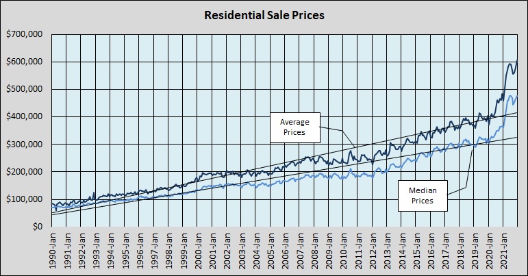
This long-term view of sale prices shows that very dramatic impact of that supply-and-demand imbalance on sale prices in 2021:
Finally, this chart summarizes our supply-and-demand situation over just the past 10 years, covering all of the current market cycle — so far — with the listing inventory (Months’ Supply) issue of the past two years highlighted:

It’s too early to draw conclusions about January 2022, but a preliminary look as of January 22 indicates that average and median Days to Sell are about the same as last month, and that prices are essentially flat compared to December. We’ll know more in a few weeks, and I’ll keep you informed.

Discussion
No comments yet.