This morning I posted an article on AustinMarketInfo.com containing recommendations from real estate professionals about how to approach buying a home in the current market:
I included it on my website because I agree with most of the recommendations. However, like much national press these days, buyers and sellers in Austin and Central Texas need to adjust their perspectives in an important regard:
or the general decline in property values that other metro areas have experienced.
In those hard-hit cities and states, buyers may hold a significant advantage.
That is not necessarily true in Central Texas.
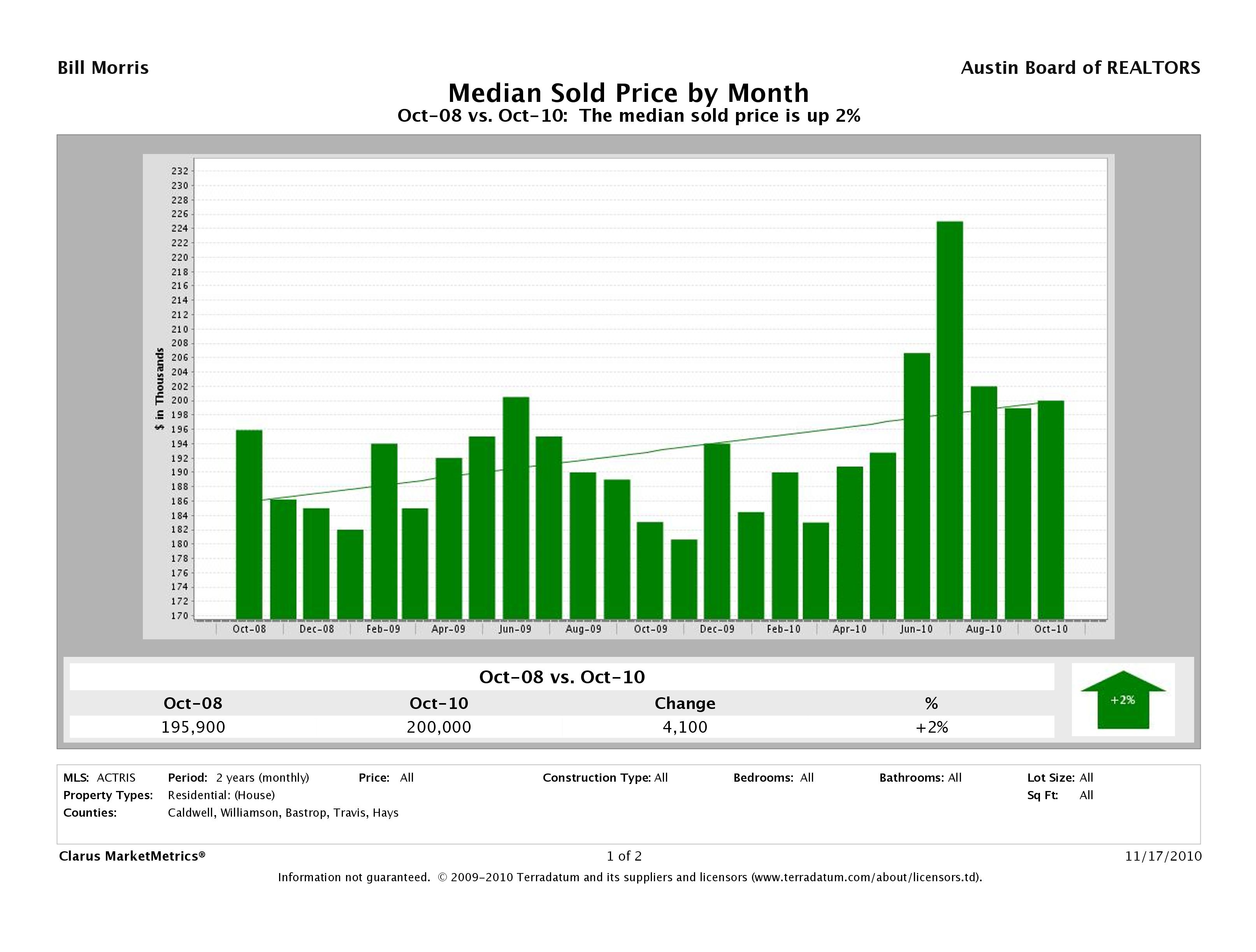
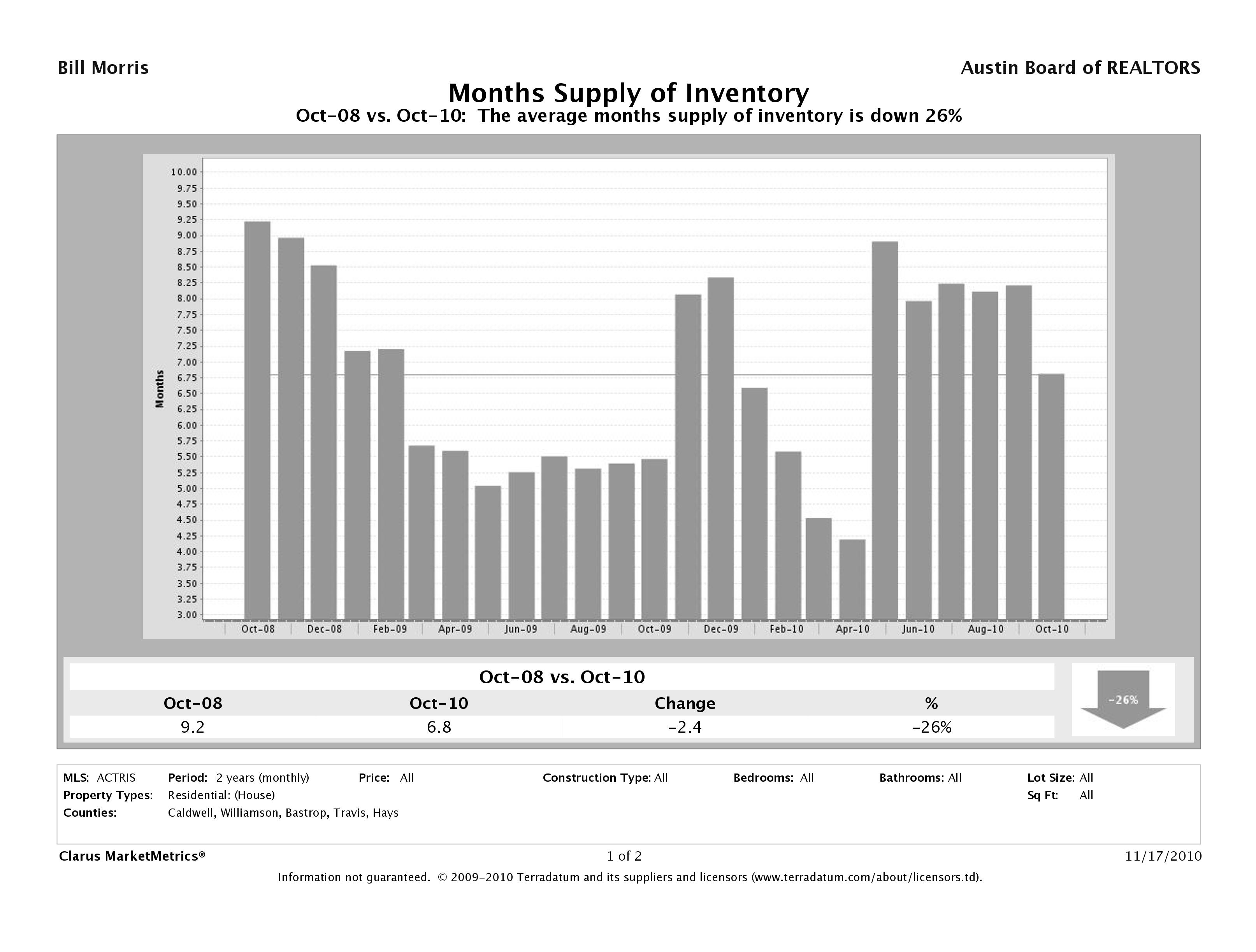
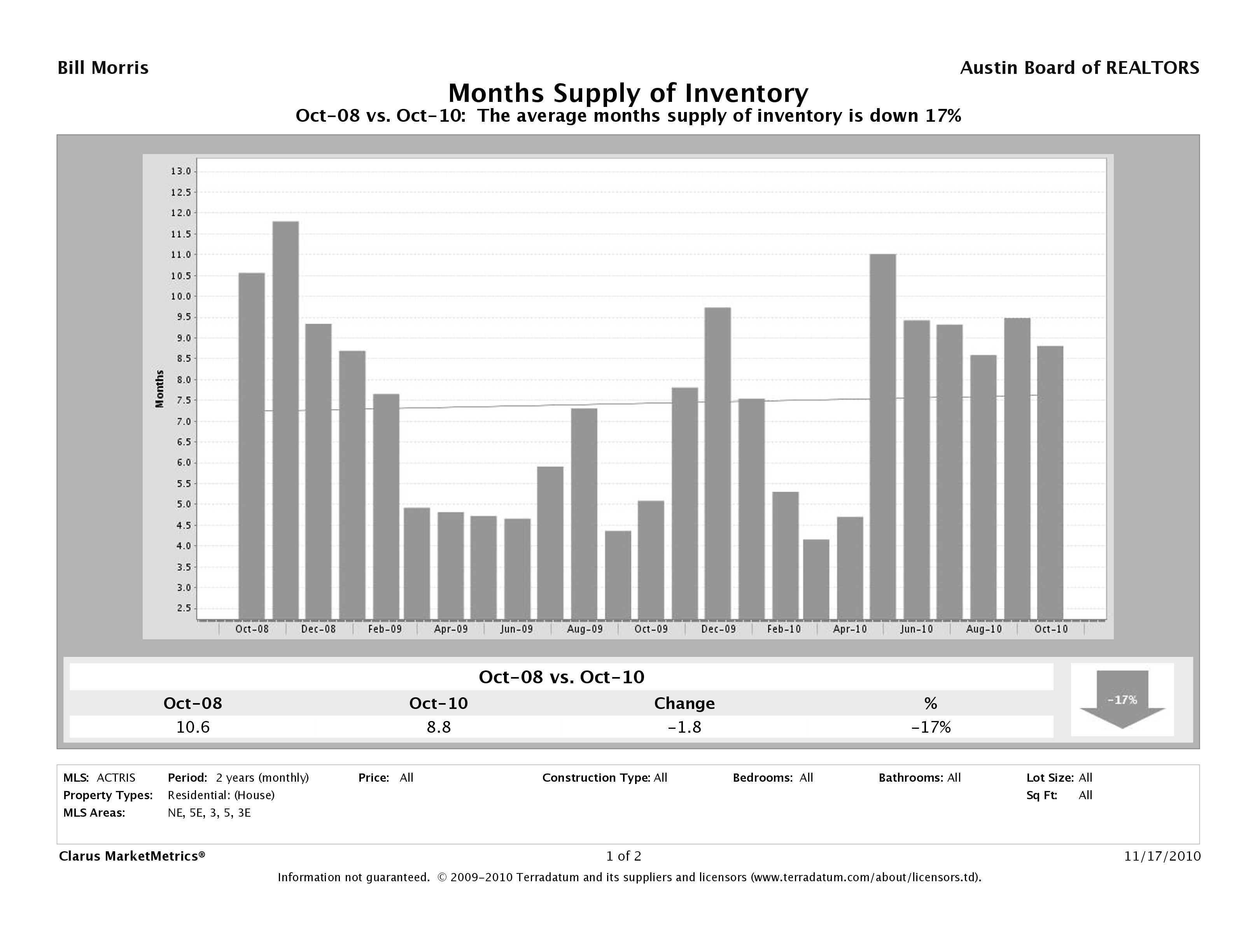
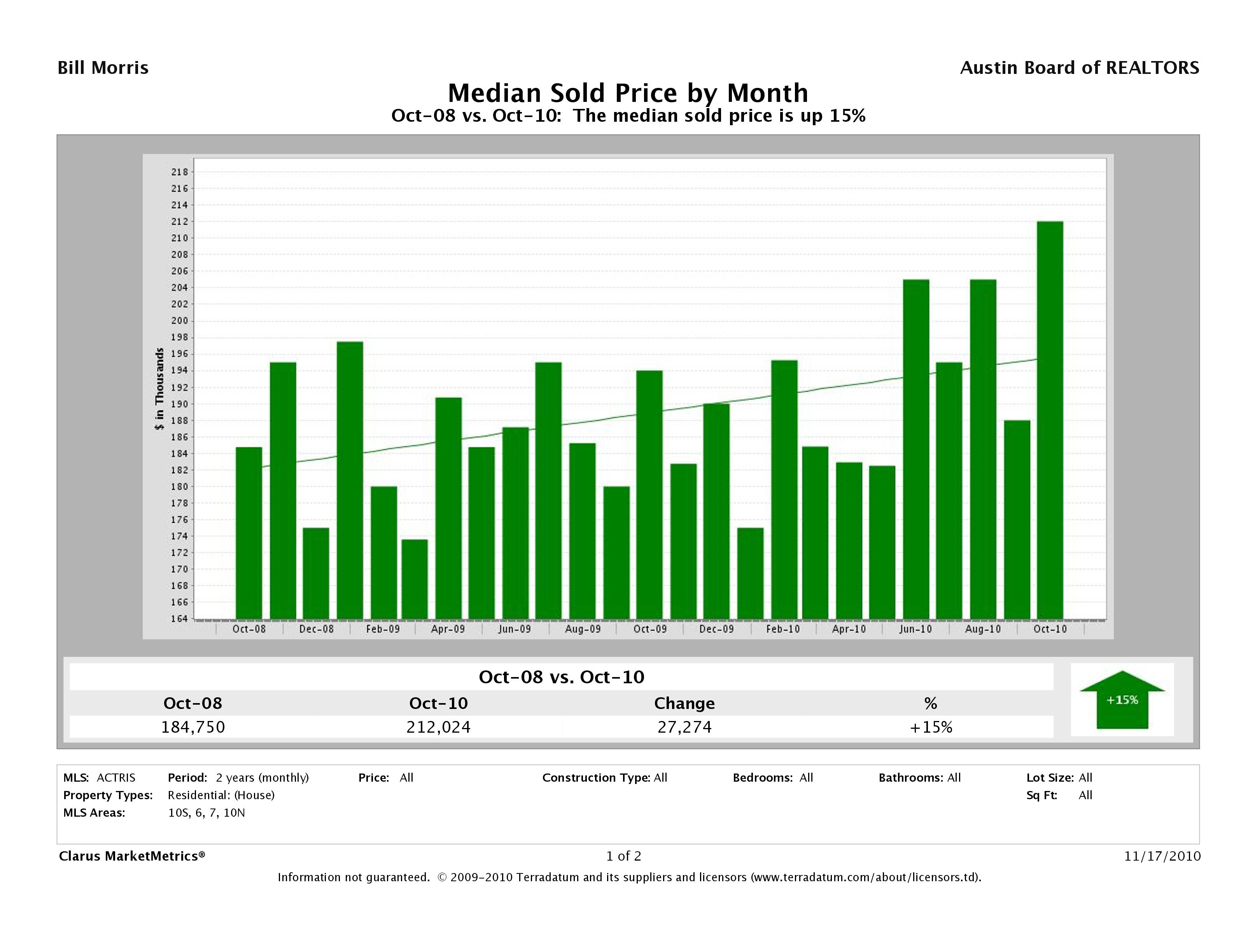
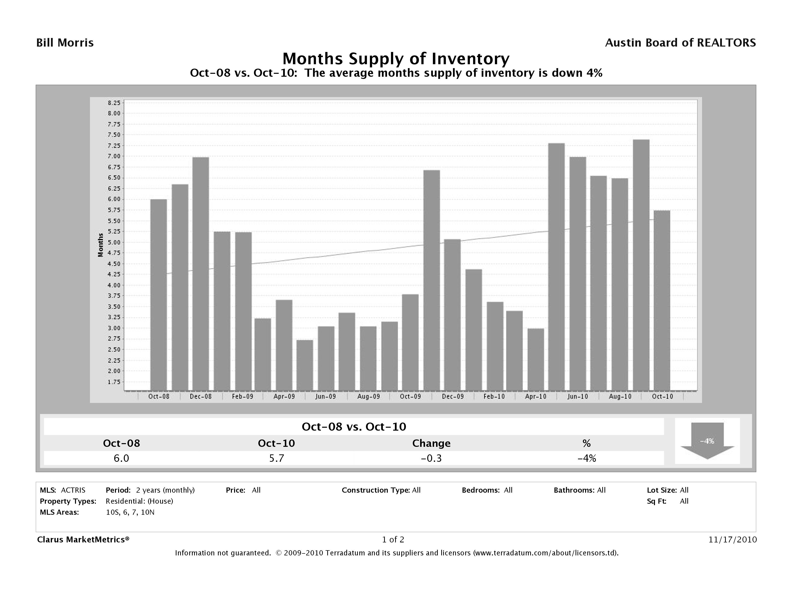
Note the clear trend in median prices over this two year period, and the level of listing inventory in October 2010. Most analysts consider 6 to 6.5 months of inventory to be a “balanced” market, conditions that don’t strongly favor either buyers or sellers. You can clearly see the effect of two homebuyer tax credit programs on inventory, but on average this has not been a seriously over-supplied market. Obviously, at the peak levels of 9 to 9.25 months’ supply conditions favored buyers, but the worst we have seen of this housing crisis was far better than “typical” conditions over the last two years in California, Nevada, Arizona, Florida, and Michigan.
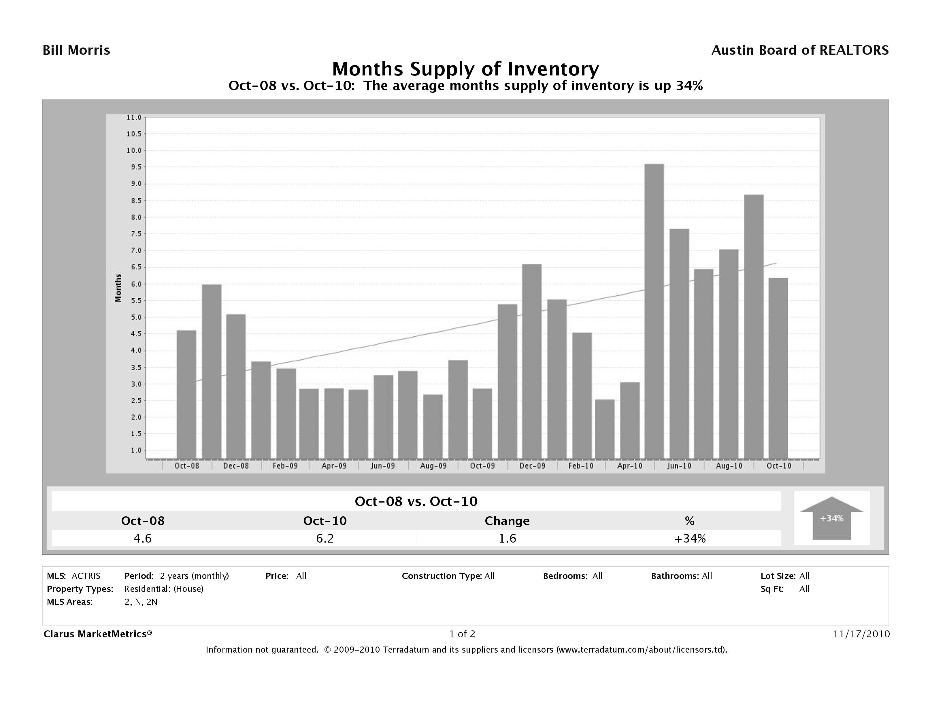
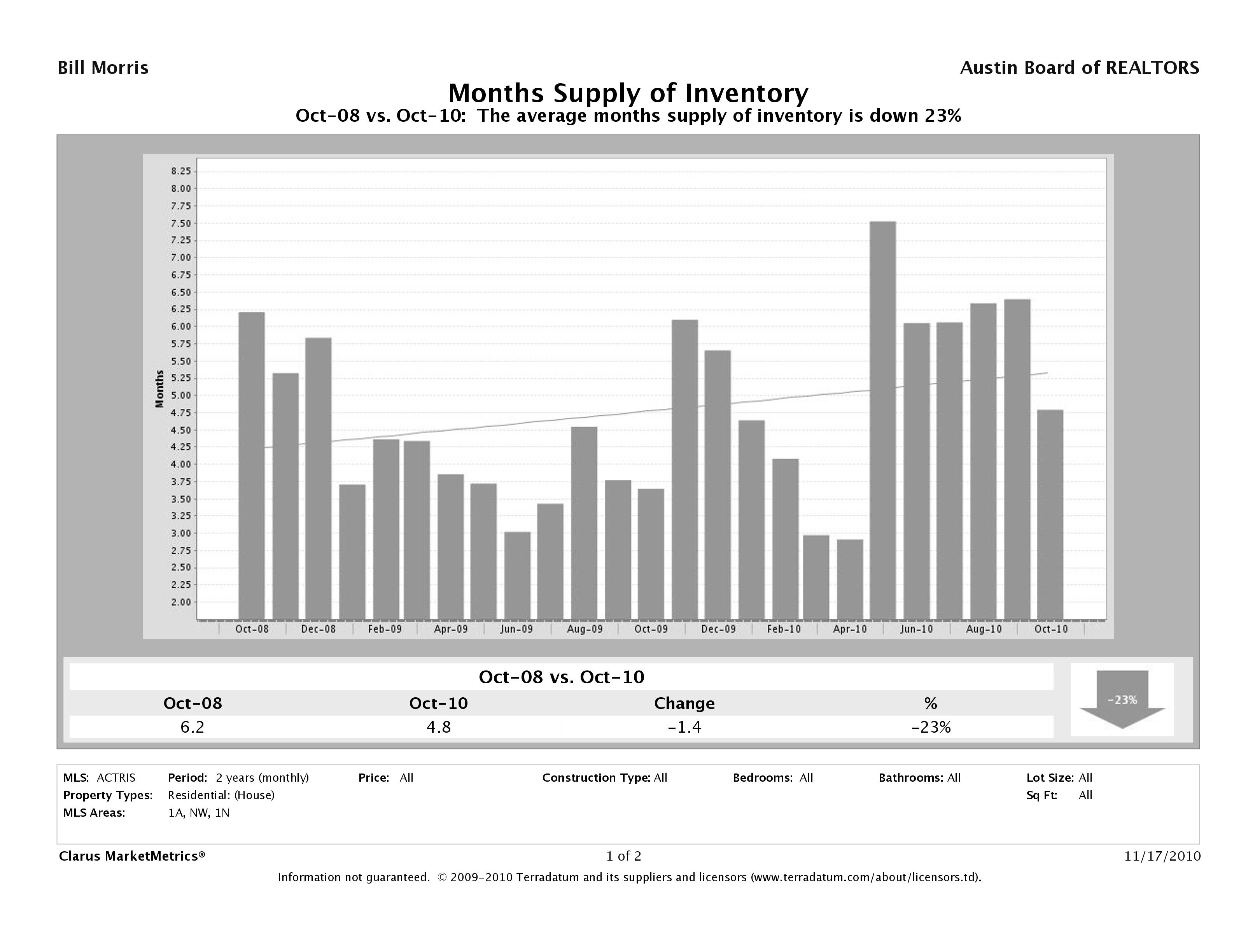
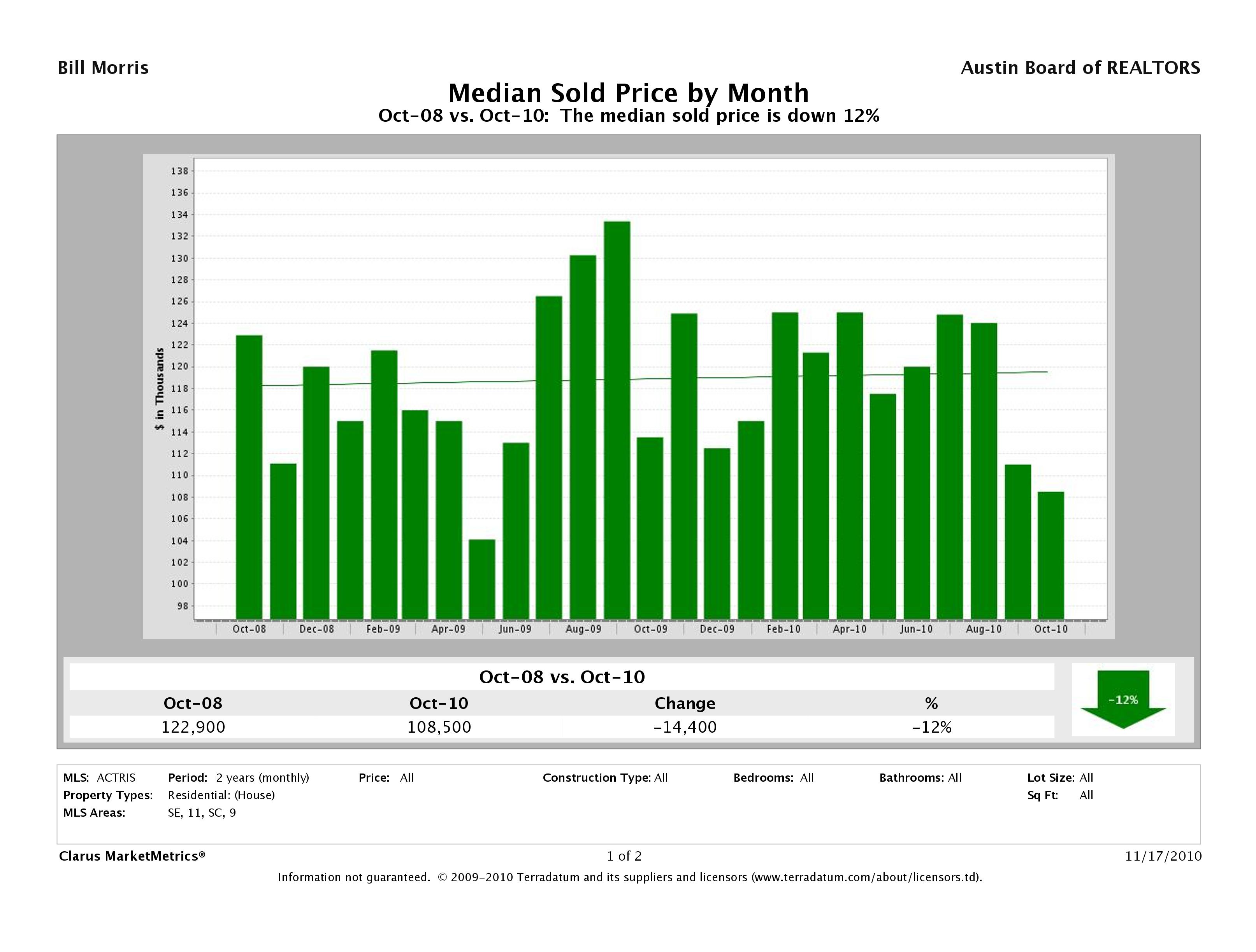
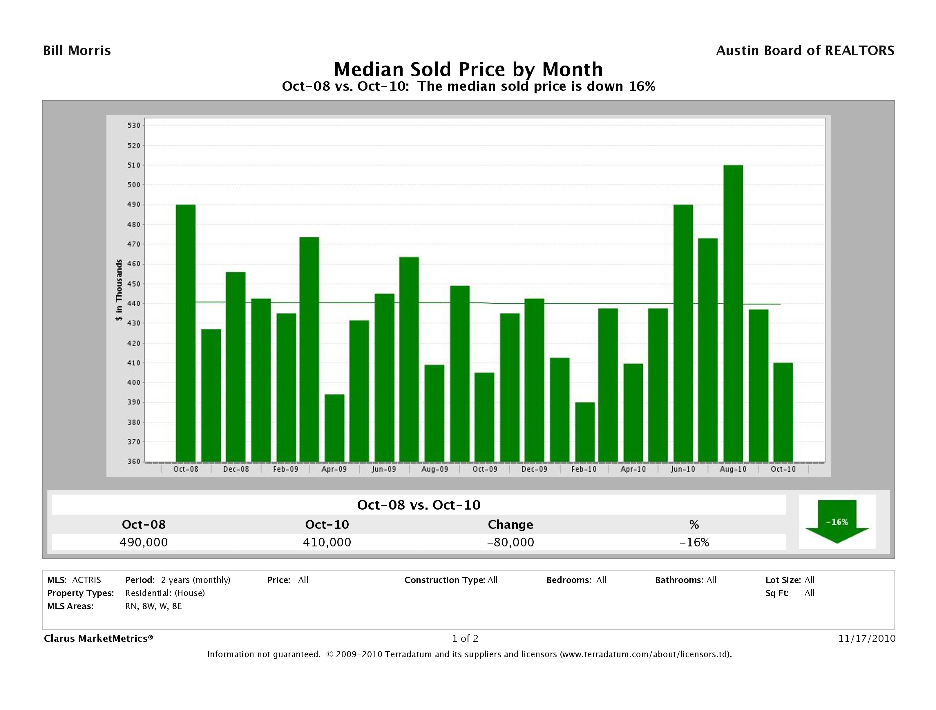
Now, here’s how different parts of Austin have fared:

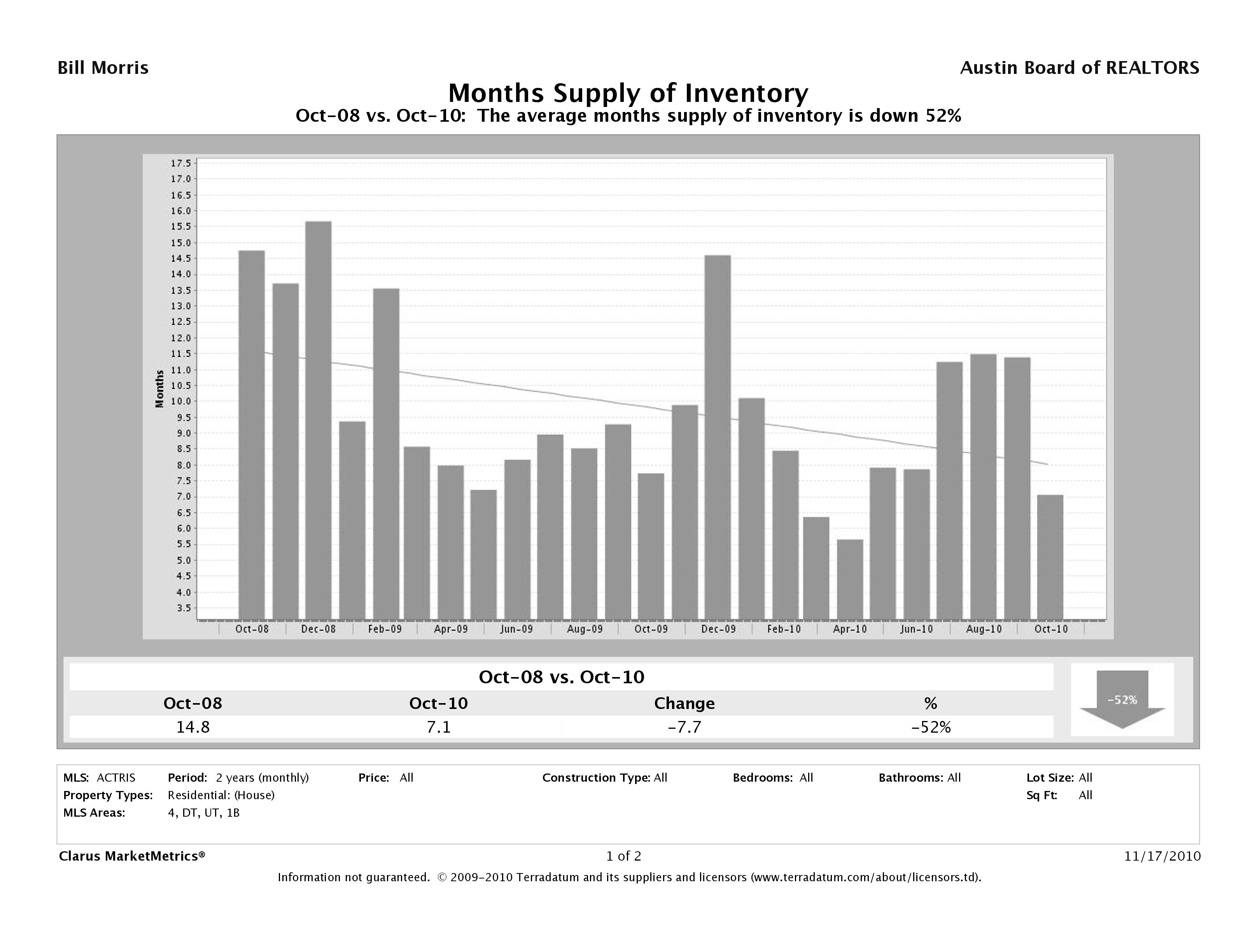
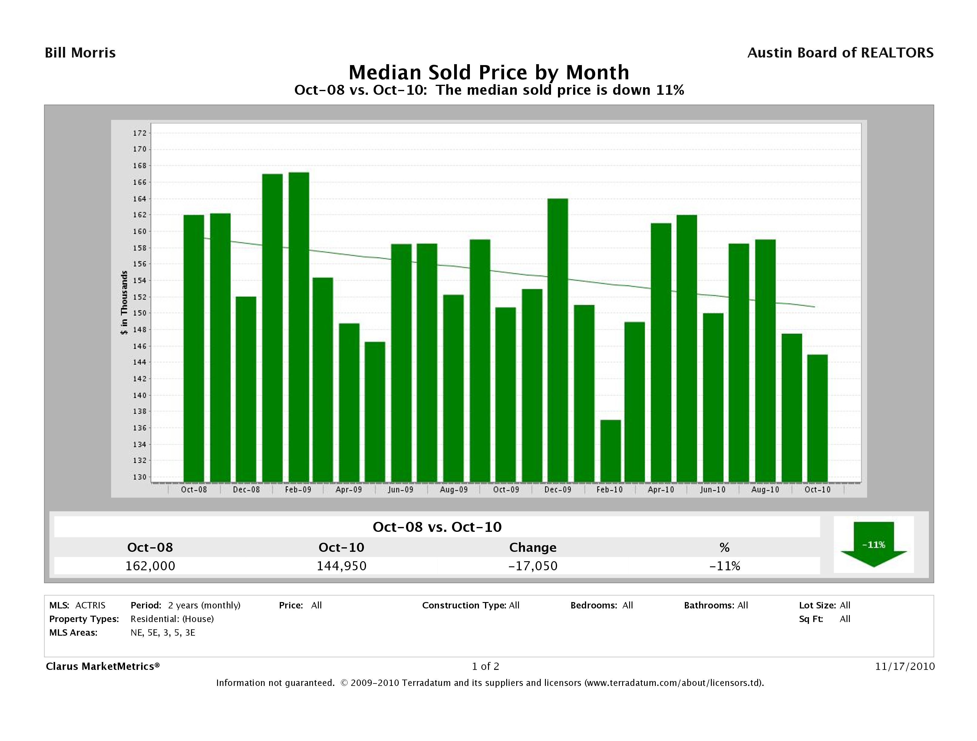
(Note: Listing inventory has accumulated somewhat in North Austin, but in October 2010 it still represented just over six months’ supply — balanced market conditions.)


Notice that I have not addressed suburban cities and towns adjacent to the city of Austin, but they are included in the Austin Metro charts near the top of this post. For ongoing monthly updates on the status of the Central Texas real estate market, feel free to refer to my Austin Market Dashboard, updated around the 20th of each month with final data for the previous month is released.
As I have pointed out many times, while market averages are useful, they do not substitute for narrowly focused analysis of the value of specific property that you may consider selling or buying. In each of the areas included above there are neighborhoods and size/price market segments that are significantly weaker than the averages shown, and other segments that are much stronger.
General economic uncertainty and two rounds of homebuyer tax incentives make all market less predictable this year than most. We will probably see a few months of seasonal “softness,” but there is no reason to expect a flood of low-priced listings that affect general price levels in the Austin area. There is every reason to expect both prices and mortgage interest rates to trend upward in coming months. One of those factors may argue in favor of sellers waiting to enter the market. The other may influence buyers to accelerate their plans, and sellers who wait may miss “the” buyer for their homes. The point is that “timing” the market is always difficult, and even more so now. If you’re thinking of buying or selling residential real estate in the Greater Austin area, consult with a real estate professional sooner rather than later and make your decision based on focused information, not averages or national press reports.

That’s pretty good. In fact that’s the only attempt to do this by area I’ve seen. It would be helpful to give us 12 month rolling periods for number of sales and prices. I don’t find inventory that useful. Can you go back before 2008? You have a change to build a very valuable website here so you can be THE online resource in Austin.
We need the number of sales compared to various 12 month rolling periods to see if the average sales prices have enough volume to be trusted.
Two great sites to use as a model.
bubbleinfo.com
rereport.com
Posted by Mr. Bubble | November 18, 2010, 3:20 AMConfident that we’re not really seeing any serious departure from general market trends, I invested some time last night and today to assemble five years of market history in West Austin — MLS areas 8E, 8W, and W. The results are available at West Austin Market History 2005-2010. The seasonal volume peaks in 2006 and 2007 are clearly visible, as are a couple of peak months for average sale prices. Generally, though, average prices have been almost flat over this five-year period. Moreover, 2010 has been very strong in terms of sale volume.
As I mentioned in a separate comment yesterday, accumulating data below than the metro area level is time-consuming, but I was intrigued by our dialogue and wanted to offer this snapshot. Undoubtedly, if I were to dissect this data by neighborhood and/or size/price segment we would see the same “hyperlocal” strengths and weaknesses that are present everywhere, but I hope this is helpful.
Posted by billmorrisrealtor | November 19, 2010, 8:08 AMThese guys started doing it but quit long ago.
http://www.escapesomewhere.com/mlsareaprices.html
Posted by Mr. Bubble | November 19, 2010, 9:05 AMThanks Bill. That is a great chart. With the seasonal variation it’s hard to see what the real trend is. Can you calculate a rolling 12 month moving average and show it as a line? Can you draw a line with number of sales each month through the chart?
Posted by Mr. Bubble | November 19, 2010, 8:43 AMClick here for the same chart, now with 12-month rolling averages. Given the report today that Austin is on pace for the fourth consecutive decline in home sales, the relative strength in West Austin is impressive. Overall, the median price in the Austin area is up, and strength in upper price ranges is certainly part of that.
Posted by billmorrisrealtor | November 19, 2010, 10:10 PMI can’t tell which line is solds and which is list prices.
That’s looking pretty good.
My take on today’s news about number of sales is that buyers have been (In many cases on the advice of realtors) listing homes above market prices so fewer and fewer are transacting. When they do, they are taking longer to sell, which, in effect, is lowering the prices because of the time value of money and carrying costs.
As far as the notion that prices are higher, I think that’s merely more high end homes selling relative to low end homes, which pulls up the mean and the median. Out in Westlake, if you go out looking, pricing is looking better and better.
My last request, datawise, is that you include ppsqft. I know realtors hate using it because there are differences within zips but, investors love it as a basis for understanding prices.
I guess you could also just present that data annually, since you are going back 5 years, and give YTD 2010 or an extrapolation to give a 2010 estimate.
I love this data! ABOR should put in on the site. Shame on them for being so secretive.
Posted by Mr. Bubble | November 19, 2010, 11:01 PMToday’s story says that this is the 4th year of declining sales. Can you give the totals for each of the last for years? If the number of sales has declined a lot, the strength of pricing is less impressive because not many people actually got those prices. I saw this in another market where I have a home. While comps showed pretty good prices, the reality was that the number of monthly sales fell from 25 to 5. So demand fell, but supply fell as well, maintaining the illusion of high prices. However, few buyers or sellers could actually transact at those prices. Those were impatient or very wealthy, therefore price insensitive buyers.
Posted by Mr. Bubble | November 19, 2010, 11:15 PMIt’s been a busy week since you posted this question: there is a lot of market activity now, picking up since about mid-October according to most working Realtors® that I talk to — in most price ranges, including the low end, which had slowed very significantly in September. Here is the annual (YTD) comparison since 2005:
As I have commented elsewhere, and you wrote previously, the strength in average and median home prices is not necessarily an indication that prices increased across the board. We haven’t seen real across the board weakness either, but growth in average prices is a result of a shift in the mix of sales. Over the past four years, the percentage of homes sold in the $100,000 to $120,000 range is down 35% to 40% depending on exactly how you choose to do the calculation. At the same time, the proportion of sales in the $200,000 to $250,000 range is up 25% to 30%. In addition, this year there has been almost a 10% increase in the proportion of homes sold between $300,000 and $400,000. If you haven’t seen it, you may enjoy the details at AustinMarketDashboard.com.
Posted by billmorrisrealtor | November 30, 2010, 5:11 AM