As you saw in Austin-area Market Dashboard our residential real estate market climbed in 2012 and in 2013 began the boom cycle that we have enjoyed for almost seven years now, marked by very low inventory and rising prices. The Real Estate Center at Texas A&M University provides a useful tool for thinking about those price trends — the Home Price Index.
First, here is a comparison of five major metropolitan areas across Texas:
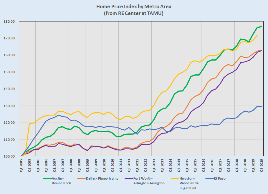
If you visit the Real Estate Center’s website you’ll see that they have more data for some areas than others, but I have re-indexed all of these to 2005 so we can compare them easily. The general slopes of four of those five lines are about the same. The exception is El Paso, which in 2019 is just a little higher than it was in 2007. Dallas and Fort Worth diverged a little during the early years of the recent boom and have essentially reconverged this year. Houston led Austin (and the rest of the state) in price appreciation until about two years ago, when Austin moved ahead. (Note that the RE Center didn’t have 3Q 2019 for Houston when I built this chart.)
Focusing on the Austin metro area, the HPI data allows us to see a little more — price changes in different tiers of the market. Here’s a longer view of just our area:
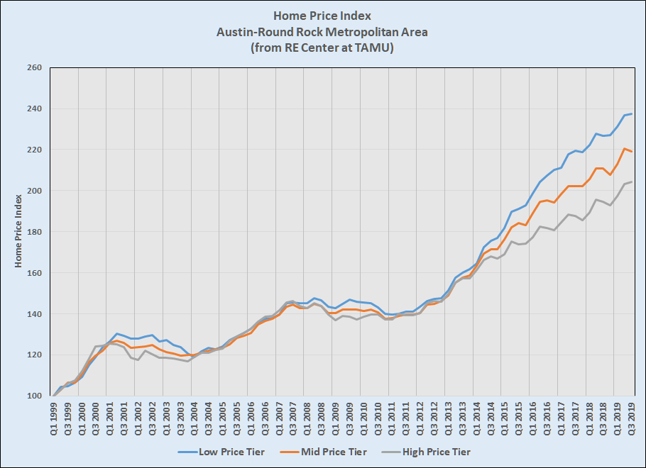
I included that longer history to illuminate differences in this market cycle compared to the last two. First, this cycle has lasted MUCH longer than the others. Second, and interestingly, the price growth rates of the three price tiers differ much more this time. Those rates certainly diverged in previous cycles but not so noticeably, and then they came together again near the beginning of each new cycle. In all three cycles the Low Price Tier was lifted the most and the High Price Tier the least, perhaps not surprisingly.
Lastly, this chart shows the annual changes in the price tier indices:

In this view you can see the rise and fall of home prices generally, and the merging of all three price tiers this year is especially noticeable. There is an important difference this year, though. After 9/11/01 and the Dot.com bust, price changes in all tiers were below zero for about two years. After the mortgage industry downturn in 2007 price changes went negative twice in the following four years. At no point in this cycle has the pace of price changes approached 0%, and there doesn’t seem to be movement in that direction.
I have been writing for a while about the slowing pace of price increases in our market, but prices are still increasing. As I have said many times, the strength of our local economy and real shortages in housing supply continue, and those forces will continue to exert upward pressure on home prices. I’ll keep you informed.

Discussion
No comments yet.