Things are looking up! Even with a few lingering mixed signals, housing nationally appears to be in recovery:
Existing Home Sales Hit 5-Year High in 2012
In Austin, there are no mixed signals:
Austin-area home sales hit six-year high
Austin is America’s fastest-growing city
Living and working here, you can feel the growth. The pace of the real estate market feels like 2006 again, and maybe even a little more frenetic! The numbers bear out those reports. I’ll include links to my complete Austin Market Dashboard at the end of this post, but here are some highlights.
First, let’s get a little perspective about the market cycle we have just completed with a review of market activity in the Austin Metro area since 1990:
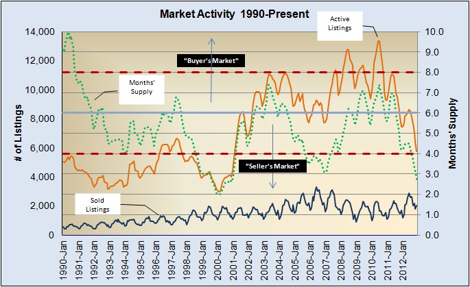
There is a lot to see in that chart, so I’ll offer a brief explanation. The orange line is Listing Inventory. The dark blue line is Monthly Unit Sales. Dividing Listing Inventory by Monthly Unit Sales yields Months’ Supply — a measure of market velocity. Most analysts consider 6 to 6 1/2 months’ inventory to represent “balanced” market conditions. For ease of reference I have drawn the 6-month line. The farther the Months’ Supply moves from that 6-month reference point, the more noticeable market imbalance is — less than about 4 months’ inventory is clearly a seller’s market; more than 8 months’ inventory strongly favors buyers.
National reports on housing in recent years have often measured inventories well over 8 to 10 months — even multiple years in some local markets. We actually saw a somewhat similar situation in 1989 and 1990, during and after the savings and loan crisis that flooded the market with HUD foreclosures and enormous uncertainty. Over the past two market cycles, however, inventories in Austin have peaked at about 7 1/2 months’ supply. Our metropolitan market has varied on the low side, and we are now approaching an all-time low inventory last seen in the 1st quarter of 2000.
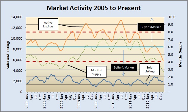
Zoom in on the period that fully encompasses the most recent market cycle:
If you have been a homebuyer (or would-be homebuyer) over the past year, you know the frustration of making what looks like a fair-market offer and losing in multiple offers to a buyer who probably lost at least once more than you had at that point. I sold many listings in 2012 for more than my analysis said they were worth — enough that I was concerned about them appraising high enough to complete the sale. Good appraisers, however, took market conditions into account to the extent that their required procedures allowed. I also saw a couple of transactions that did have to be adjusted for low appraisals — definitely exceptions, however.
For a more direct look at market absorption, look at the percentage of active listings that sold month-by-month over the entire period:
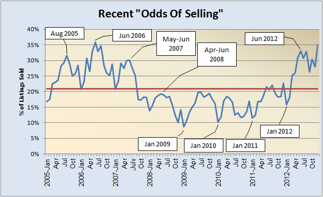
It’s not shown in this chart, but we actually saw a couple of months in 2000 in which more than half of all listings sold. Other than that, though, June 2006 was our peak activity with 36% of all active listings sold. Look at what happened between January and December 2012 — a steeper climb than 2006, closing the year at 35% absorption. Not only is it approaching the 2006 peak, but the last 2012 spike happened in the 4th quarter! There were a couple of years out of the past 22 in which December absorption equaled mid-year levels, but there are no examples in the years I have studied with activity at the pace we saw at the end of 2012!
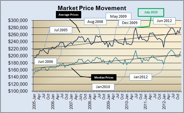
As you recent homebuyers and home shoppers know, that market strength is reflected in sale prices. I’ll comment on market price distribution in a separate post, but you can see that the shapes of the average and median price curves in 2012 tracked the “odds of selling” line very closely:
Using 12-month rolling averages filters out seasonality and allows us to compare “then and now” more fairly. Here are unit sales and average sale prices on one chart:
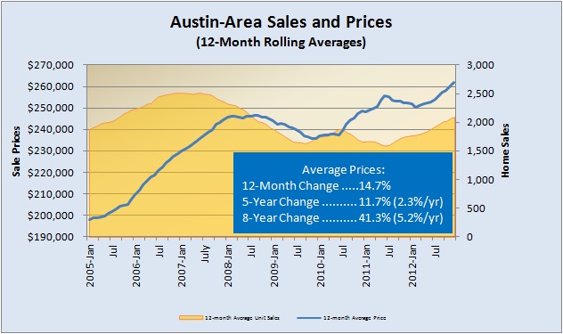
Yes, that average sale price in the Austin area increased almost 15% from December 2011 to December 2012! The upward pressure will continue in 2013. You can see how that compares to the pace of change over the 5-year market cycle and over the entire 8-year period covered in that chart. For a fair view, compare to the 20-year average rate of 7.9%. We are living in the growth phase of a new market cycle. We have not become California!
For consolidated, printable views of my Austin Market Dashboard, link here to PDFs, and please let me know whenever you have questions or comments:

Discussion
Trackbacks/Pingbacks
Pingback: Here’s Austin’s challenge in 2012: Housing Supply « Bill Morris on Austin Real Estate - February 10, 2013
Pingback: Fast-trackin’ in Austin real estate | Bill Morris on Austin Real Estate - March 8, 2013