Following up on a recent post (Austin sales performance by price range, 05/07/11), I am writing to summarize a 30-day snapshot of home sales in different parts of the Austin metropolitan market. Our MLS system is built around a series of geographic “Areas” by which the listing database is organized. Those “Areas” can be grouped into what the MLS calls “Regions” — the level at which I have chosen to focus for this post.
A recent conversation with a friend about a family member’s home led to discussion of “days on market” as a measure of market strength, and whether higher price ranges in the Austin/Central Texas area routinely take longer to sell than lower prices in the current market. I argued in that last post that it is not the price by itself that causes a market segment to move slowly, but how well that price compares to “perceived value” in the neighborhood or area. Today’s post pursues that further.
First, this chart summarizes all sales of single family homes from April 7 to May 7 (the day I assembled this data). It’s an unusual timeframe, but I wanted to present the closest to a concurrent view of listing inventory and immediately past sales:
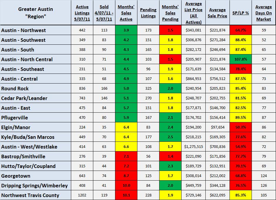
Notice that three columns are highlighted. Explanations:
- “Months’ Sales Active” — Simply Active Listings divided by Sold — This indicates how long it would take for the market to “absorb” existing listing inventory at the most recent pace of sales. About 6.5 months’ inventory is generally considered to be a “balanced” market so I highlighted numbers in that immediate range in yellow. Lower inventory levels tend to favor sellers, and I highlighted those in green. Higher inventory levels tend to favor buyers, and I highlighted those in red.
- “Months’ Sales Pending” — Pending Listings divided by Sold — In general, Pending listings represent about 40 to 45 days’ of “yes” decisions by buyers and sellers, so about 1.5 months of sales pending indicates “flat” demand. Above 1.5, but less than 2, months of sales pending may indicate slight market acceleration. 2 months or more of sales currently under contract provides fairly clear evidence of increased demand. [Keep in mind that we’re dealing with just a 1-month snapshot in time, but at least on the basis of this information, we can draw some conclusions about the relative “velocity” of these market segments.
- “Sale Price/List Price %” — Note that this is a different calculation than you typically read about, and different that that I usually measure, too. The column in the chart above does NOT compare the sale prices with the list prices of any homes that actually sold. Instead, this compares the asking prices of homes that are currently on the market with the actual sale prices of homes that sold in the past month — a look at the “price vs. value” perception I mentioned earlier. Using this metric, it is unusual to see a market segment in which the average actual sale price is higher than the average current list price, but we have on in this sample so I highlighed it in green. On the other hand, if the average sale price is more than 20% below the average list price we have a pretty clear indication of an overpriced market, and I have highlighted regions in that situation in red. In between — regions where the actual sale price is 80% to 100% of the average list price, we generally find a functional” market depending on other factors not considered here. I highlighted regions in that situation in yellow.
Having done those multiple sorts and highlights I sorted the chart according to market absorption rate, from lowest to highest. There is no 100% consistent pattern, but the colors make a significant trend obvious: The fastest-moving markets tend to be those that are priced right, and when overpricing characterizes an area or a neighborhood, the entire neighborhood suffers.
No great revelations there, but notice that we have Austin-Central among the fastest-selling regions with an average sale price of $756,512, and we have Austin-West/Westlake among the slowest moving markets with an average sale price of $700,836. Likewise, we have regions in the “sweet spot” from $100,000 to $250,000 scattered throughout the list. There is NO direct correlation between market price and market velocity.
Now, back to the discussion of Days On Market that prompted this series of posts: It is not surprising that the slowest moving markets also tend to have the longest average time on market, but the difference is not as dramatic as you might expect. Moreover, the most over-inventoried region in this chart — Northwest Travis County — shows lower Days On Market than the somewhat better performing markets above it. The difference: market asking prices are closer to the reality of actual sale prices. Days On Market results from supply, demand, and pricing, but it is a secondary measure. Absorption rate and direct pricing comparisons are a much more direct route to measuring market health.
There are many ways to approach market analysis. Many real estate practicioners still do what their clients usually expect and base a pricing recommendation on recent “comps” in the neighborhood. That will certainly provide one indication of market value, but without a more thorough understanding of the market environment, I suggest that that approach can easily mislead, and result in a listing that is overpriced, or underpriced or, maybe, priced just right.

Hey friend can i publish some paragraph of your article on my little blog of university.I have to publish a good articles out there and i really think your post Fits best into it.I will be grateful to give you an source link as well.I have two blogs one my own and the other which is my college blog.I will publish some part in the university blog.Hope you do not mind.
Posted by Molly | May 21, 2011, 5:24 PM