In Austin Area Home Prices – 4Q 2019 I commented on rising home prices and housing affordability issues in the Austin area. That post looked at the geographic distribution of prices across the 5-county Austin metropolitan area. Now I want to look at how prices have changed over the past ten years, since the “Great Recession.” I’m still working with MLS data and focusing on single family homes. With that in mind, you should know how much the number of homes sold has changed from 2010 to 2019:
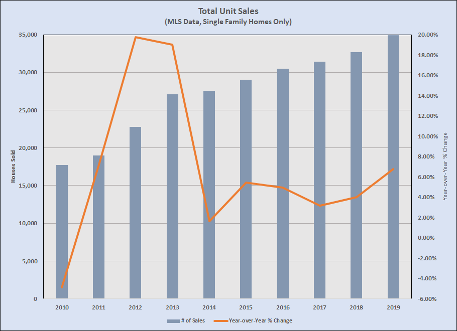
The number of home sales in 2010 was the lowest point of the recession for our area — 5% fewer than in 2009. Note also that the number of homes sold in 2019 was twice the number in 2010! 2012 was our year of recovery and the earliest stage of our market boom continued through 2013, then stabilized at about 1/3 of the pace of those first years.
As you might expect, though, not everyone experienced that aggregate change in the same way. Segmenting the resale market by price range shows some interesting variation under that aggregate sales data:

Each of the colored bars represents houses sold each year from 2010 through 2019. I’ll offer a few notes to clarify what you see in that graph:
- By 2010, the under-$100,000 price ranges had become a very small part of the overall market, and those sales continued to decline dramatically after 2011 (to just 114 total sales last year in the two price ranges).
- The next price range — $100,000 to $149,999 — peaked in 2012, the year the Austin area climbed out of recession, then slumped a bit in 2013, the first year of our long-lasting real estate boom. This price range almost evaporated as the boom continued in 2014 and beyond, with 2019 sales just 7.5% of the peak seven years earlier.
- You see essentially the same pattern a year later in the next price range — $150,000 to $199,999 — with sales volume falling 70% from 2014 to 2019.
- An important part of our market has been in transition during the past four years. Unit sales between $200,000 and $249,999 increased at a healthy pace between 2011 and 2016, peaking in 2016 and then hovering near that level, down just 3% from that peak in 2019.
- The real changes in our market have happened above $250,000. Sales between $250,000 and $299,999 grew quickly from 2010 through 2016, dipped in 2017, and regained some momentum in 2018 and 2019. And look at the steep growth in every price range above $300,000!
- During the 10 years shown, unit sales decreases under $200,000 totaled 8054 houses. Over the same period, unit sales increases between $250,000 and $499,999 totaled 8,256 houses, entirely replacing the loss of lower-priced sales.
- Sales at $500,000 and higher added an additional 3,258 units
Still looking at the entire metro area, here’s how prices behaved during that time:
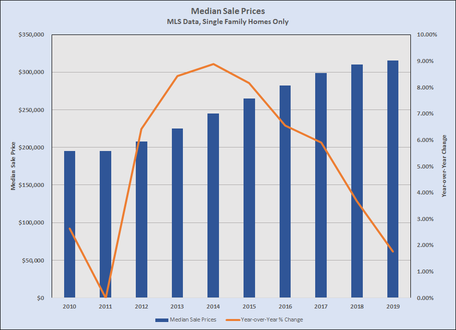
I have told you before that the pace of market-level price appreciation has slowed in recent years, and that chart shows the change clearly. That’s the combined effect of fewer sales below $200,000 and more sales at higher prices.
Finally, I have also commented (most recently in Market Pace and Pricing, August 2019) that the time to sell a home, on average, has been getting longer — not alarmingly, but measurably. That metric also varies by price range:
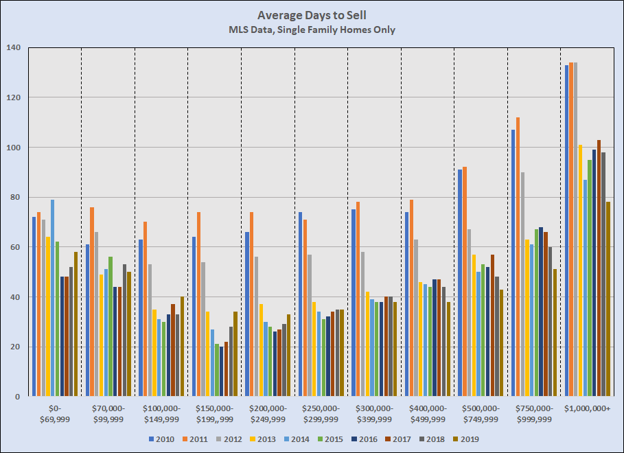
The average Days to Sell in every price range below $250,000 is up compared to 2016. Between $250,000 ad $400,000 it is essentially unchanged over the past few years. Above $400,000 the time it takes to sell a home has actually declined over the past three years. About 70% of houses sold in the metro area 2019 were below $400,000, and about 30% were $400,000 or above. The lower weight of the higher price ranges is the reason that the aggregate Days to Sell measure has been going down. (Note: The Days to Sell data graphed and discussed here is for resale homes only, because this is an unreliable metric for new construction — sometimes listed before construction begins, sometimes listed only if a completed home becomes available unexpectedly, often not listed at all.)
I still rely primarily on my market dashboard (reporting listing inventory and unit sales, the percent of active listings sold each month, and trends in average and median prices), but watching market behavior by market segment will be important in the coming year. If sales above $400,000 continue to grow — which I expect — then those price ranges will exert larger influence on overall market averages for all metrics, including Days to Sell.
My hunch, based on watching the market closely — especially new construction — is that we’ll see total sales in all ranges below $249,999 decline noticeably in 2020, and the segment between $250,000 and $299,999 will level off or decline slightly. Homes selling for $300,000 to $399,999 will remain dominant this year, with a 20% to 25% share of all sales. We will almost certainly see total unit sales increase again this year, and the pace of growth above $400,000 be the real test for how far growth in high-paying new jobs will carry this market boom. Of course, this trend also means that Austinites who are not in those high-paying jobs will have a harder and harder time staying or moving here.
In summary, I’m not concerned about Austin-area market conditions in 2020, and we have plenty of room for housing supply to catch up to demand. That said, any serious hiccups in local/regional job and wage growth and/or mortgage interest rates could have consequences that wouldn’t have affected us over the past few years. Worth watching ….

Discussion
Trackbacks/Pingbacks
Pingback: Market Dashboard – Year-end 2019 | Bill Morris on Austin Real Estate - January 29, 2020
Pingback: One last post on pricing (for now) | Bill Morris on Austin Real Estate - February 1, 2020