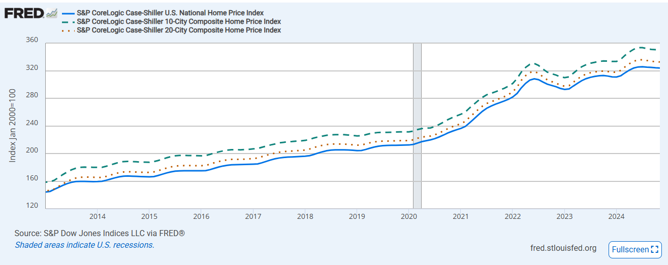
Just over a week ago I posted several charts showing the market disruptions the Austin-area real estate market experienced in recent years. These two graphs highlight how very different the last 5 years were here as compared to the Unitied States generally.
First, this chart summarizes S&P Case Shiller 10-City, 20-City, and National indices from January 2013 through 2024 as presented by the St. Louis Federal Reserve Bank:
The Austin MSA is not among the Case Shiller cities/metros, so I have charted the Home Price Index from the Texas Real Estate Research Center:
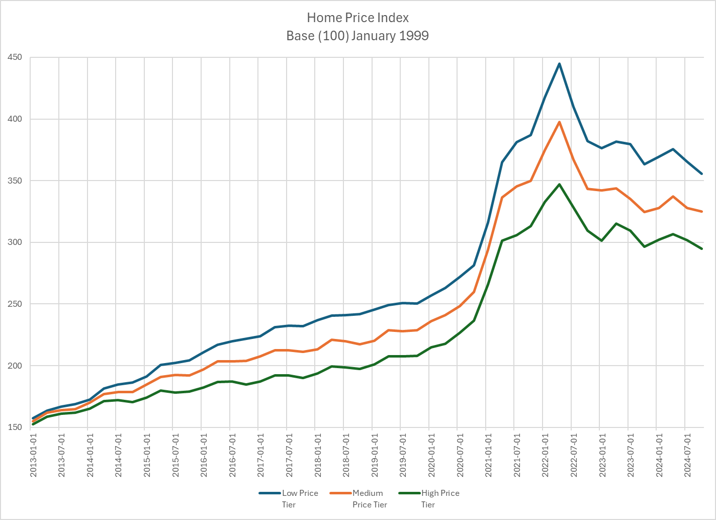
The contrast is stunning! The Case Shiller graph shows a modest price peak in May-June 2022 followed by renewed growth a few months later. The Austin graph shows peaks at about the same time in all three price tiers followed by prices returning to early 2021 levels, where they remained at the end of last year.
I’ll have more to say soon on this with a look at my Market Dashboard covering all of 2024.

Discussion
No comments yet.